Makerspace
Branding
Have you ever woken up one morning and felt that your usual suit and tie just didn’t capture your adventurous, free-spirited essence? So you decide to break free and instead slip into mismatched socks, ripped jeans, and a bold-print Grandpa sweater, ready to strut down the street with confidence? Sometimes how we look on the outside doesn’t match how we feel on the inside and we need to reinvent ourselves. Growth and change will do that – it happens all the time! We understand the power of these evolutions and the success that can be found when an organization’s values, purpose, and vision match their appearance. That’s why when our pals at Makerspace asked us to help with their re-brand…
It was a project we couldn’t wait to sink our teeth into.
Introducing Makerspace
The local hotspot for people to come together to “make good things,” Saskatoon Makerspace is a non-profit arts educational facility and community workspace. They offer the space, tools, knowledge, and resources to learn new skills, explore creativity, and make real, tangible things. Despite being a space dedicated to creativity without judgement, they felt their brand was giving more “boring cousin” and less “cool uncle.” Their goal was to develop a brand that was approachable, fresh, and fun while maintaining a level of professionalism and respectability and to increase visibility as the go-to resource for non-profit arts education in Saskatoon.
Do Your Research
Before we could start plastering together the new vision for Makerspace, we needed some insider knowledge. How did Makerspace view itself internally and what were the perceptions of the public? To understand how the people of Makerspace felt about their current brand, we developed a logo questionnaire and engaged in a discovery session to peel back the layers of the desires for the new direction. To get a feel for public perception of Makerspace, our investigative partners, Insightrix, stepped up and performed a brand audit. With the results of the discovery session and brand audit, we compiled a discovery report to help guide the new creative direction.
The Transformation
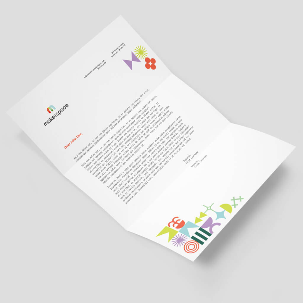
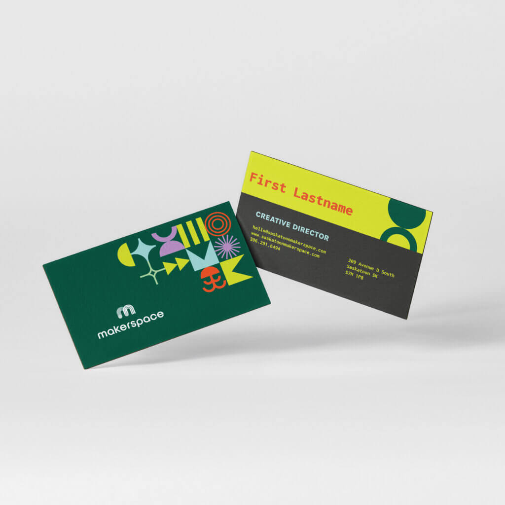
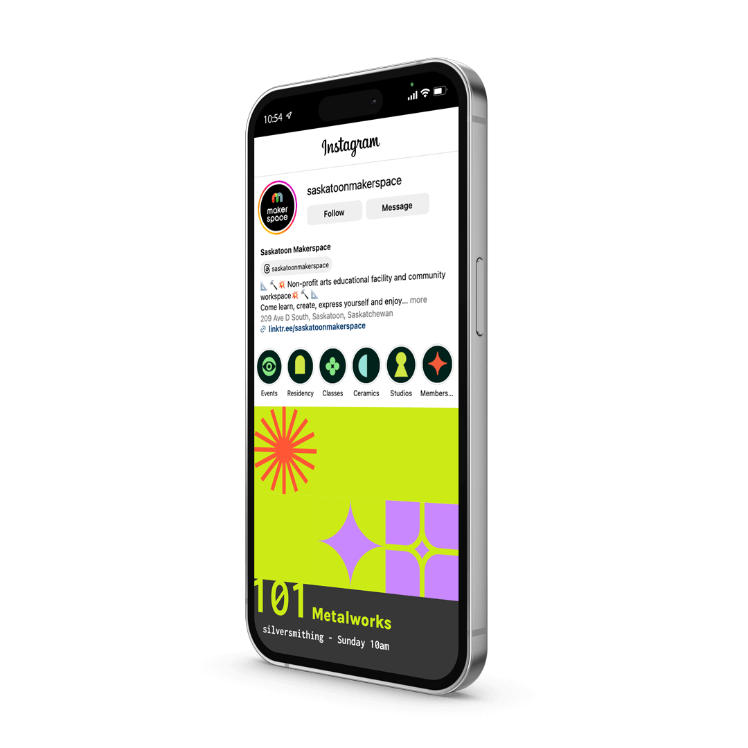
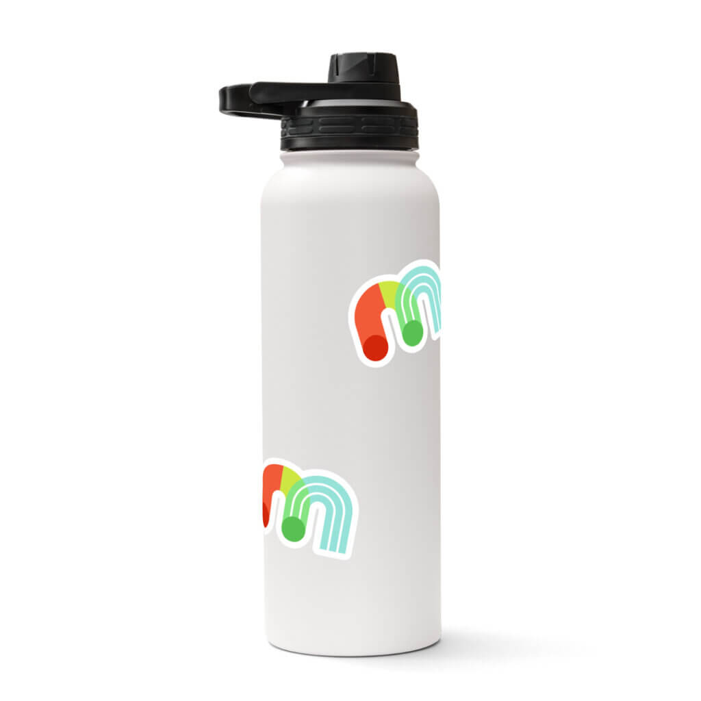
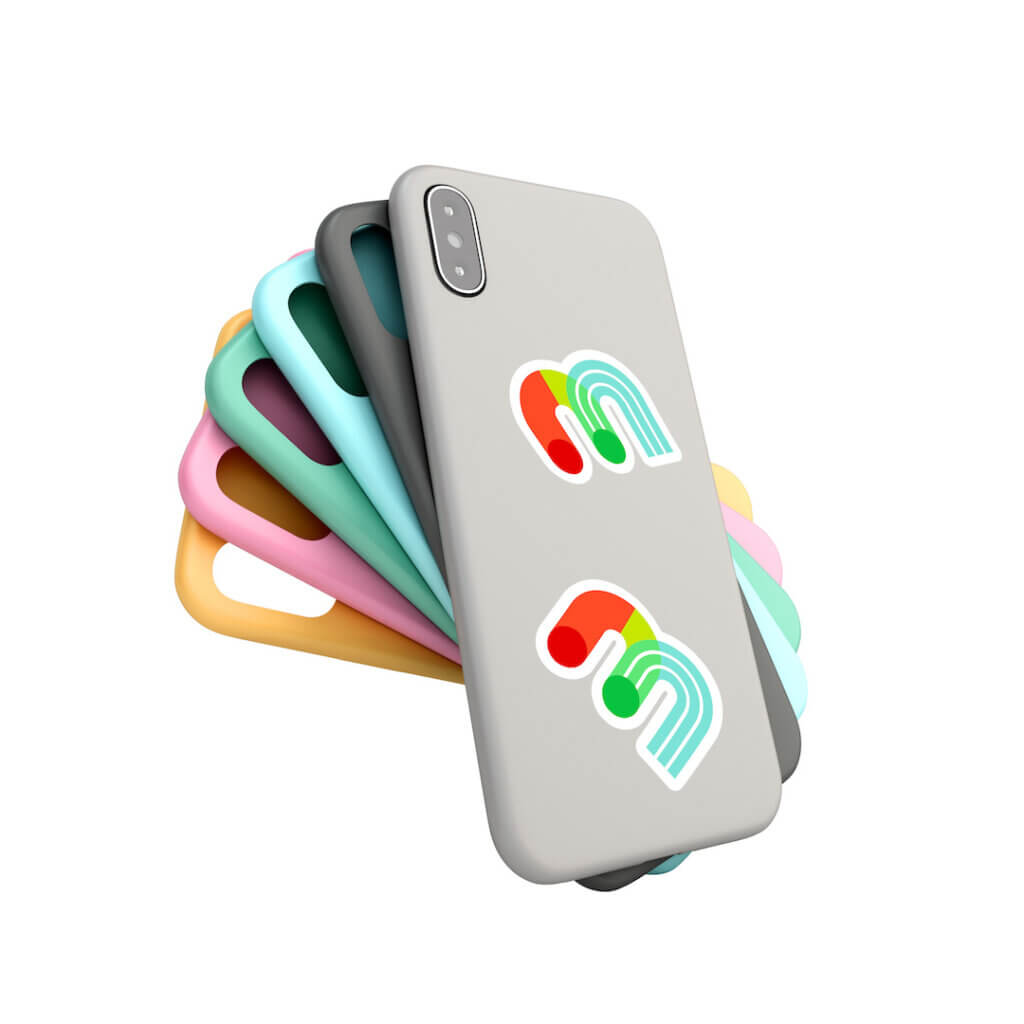
Through our research, we knew that Makerspace liked the foundation of their brand, but it needed some finesse. Using the information gathered in the discovery report, we created a new face for Makerspace backed with the strategy for why and how to put that make-up on! The final package was complete with brand guidelines, a new logo, colour expansion, typography, iconography, and all the necessary details to make the rebrand whole and cohesive.
Client Feedback
The new look served the “cool uncle” they were hoping for and their feedback reflected that:
It’s everything we hoped for and more! We are beyond stoked to have worked on this with some amazing creatives, all of which represent the kind of community we are continually building here at Makerspace. They understood our mission and perspective, and came back with an amazing product that we are so excited to be sharing… We couldn’t have done this without them.
hightlight text

